We were given the task to use our initials and come up with as many logo's as we could think of to represent them. They had to be in black and white.
This is what I came up with:
Then we all as a class had to put our designs out on a table and individually go around and tick three designs from every ones work that we really liked.
Them from there we had to use the most popular design with the most ticks and further develop it. This is the logo that was chosen:
After we had finished designing the logo, we were told that the logo was for a modelling agency that was putting on a modelling competition for teenagers in Wagga. We had to come up with a flyer that represented this and we had to organise all the information ourselves.
This is the first flyer I came up with:
I do like it with the silloettes in it, but there is just something about it that I can't quite work out. Maybe its the rays behind it or the colours im not quite sure but it was my first design so there are going to be plenty of flaws in it.
I designed a second flyer that I found even though it is very simple I find it to be very strong in design that gets the message accross and is eye catching, plus ensuring that it is very easy to read using type that are clear and crisp. The image behind it I really liked, it is a unique photo that gives that sense of flair with the whole competition that would be needed to win. I think the uniquness of the photo makes the design work well with the type.
Wednesday, April 28, 2010
Modelling Agency
Thursday, April 22, 2010
Modern Kraft Graphic Design Conference
We were given the task to come up with a poster for a graphic design conference called Modern Kraft. We were given the basic details and then told that we had to decide if the poster needed any more information then what we were given. Our basic details were:

 very chaotic feel. This is what i have come up with during my experimentation with colour and the use of
 different sized shapes.


Final Design:

Wednesday, March 31, 2010

Tuesday, March 30, 2010
Cartoons

Coming up with a idea for 5 cartoons that appeal to toddlers was very difficult but I researched and found that little children respond really well to cartoon designs that have a lot of expression. So i designed my cartoons around figurines that have eyes as the focal point.
My idea came from my group of friends and I designed the characters around the different personalities of my friends. For example Suzie is based on my friend Sarah who does ballet. Each name has something to with the name of the person they are based off.
I really like the finished result of my cartoons and I cant wait to start on my story for the adventures of the 5 Best Friends. :)
Setting Photos
We were given a task by nathan to test out the different setting on our cameras. They were:
Macro:
Sports: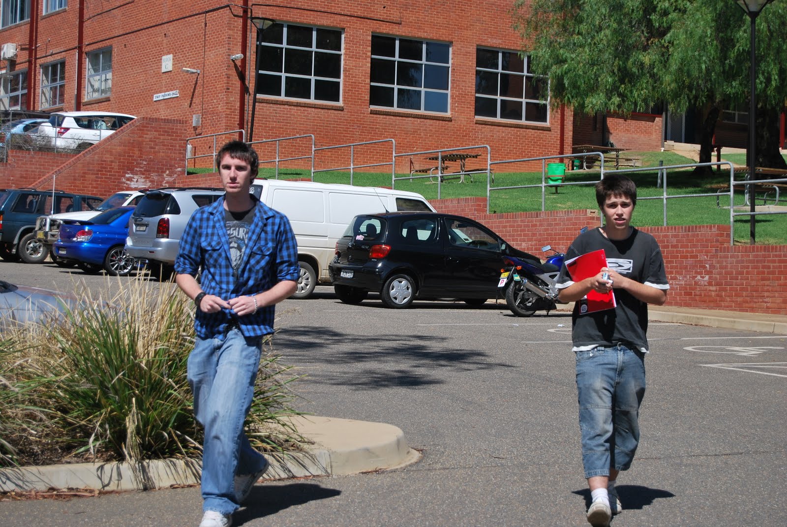
Macro:
Landscape:
Portrait:
Monday, March 29, 2010
Vector Base Images

We were asked to recreate images from the internet into our own vector based illustrations. For the ones doubled up is just to show the camparison in how much better the vector based images are. I am now a Pen tool Master thanks to the family guy image!




Tuesday, March 23, 2010
Business Logo - Deaconsfield Solicitors
In class we were given the task to create a logo for a business. We were put in groups and in my group were Nathan and Nicole. We were asked to come up with a name for our designer business that we were in. At first it was difficult to think of something on the spot but in the end we decided on the name PPL Designs, as it is a combination of the first letter of our last names.
 When we first received the job the first thing I initially did was brain went crazy instantly thinking about what I knew about law, solicitors and how to represent that in a professional and classy way without it looking stereotypical. When I sat down I started brainstorming in my head and just started to draw in the notepad I took in with me things that were coming into my head. As soon as I heard that he wanted something to do with law I instantly thought of the justice scales and how to put that into a logo that would look classy and still manage to illustrate a tight design.
In the group we discuss our ideas and what we thought would work and what wouldn’t and we sketched rough ideas in our visual diaries. Nicole went for the more natural, organic style, which was working quite well. Nathan and I went for a more geometrical, modern design. As we talked more about it we were able to incorporate our ideas into a group design.
 Our very first design we did as a group, which we discussed and found that we had very different ideas, so we sectioned off and worked on our own designs and would come together when we were done to give thoughts on what we would present to the client in our next meeting. My own design was looking at how I could make the “D” become the main logo and identity for the business. Using geometrical shapes and a modern style approach to my design I was able to use the blues and greys to work well together to create something presentable to the client in our second meeting.


 friendly, professional business. Looking at my designs first he liked the first design that we did as a group. He liked the logo but asked for a few changes on the logo, making the “d” a bit bigger and making it more cut out and out in a box making it look more tight and classy. He didn’t look at my second design and moved onto Nathan’s design and basically said in a nice way he didn’t like it at all but liked the font he used. Moving onto to Nicole’s designs he really liked the organic feel that she had portrayed in her designs. But asked to make some slight changes in the way it was presented.
After the second meeting and getting feedback, the progression of my logo I found it did become tighter. By placing the box around the design it did become tighter. The initial design I did agree with the client was very loose and free and need to be pulled together to create that tightness needed in a good design.
I did find the whole process very enjoyable as I do like working in groups as well as working as an individual. I found the process to be something that I really did like, as it involved not only using my people skills to deal with the client and working as a team but my skills as a designer. I found I do thrive on the high expectations for different designs needed from me but also the time limits, I found I work well when time is structured and there is a limit on having to decide on a final design to sell to the client as their logo. I really liked listening to the different designs that each person in my group had. Each of them being so different but being so successful in convincing our client that they would work well in his business.
All in all I think the days work was very successful, given a bit of a bumpy start with a few of the designs we were able to work though it and work towards something that represented class and style for Deaconsfield solicitors. Being able to work the way we were and having someone else’s opinion there to guide me personally was useful. Especially picking up on embarrassing things that the client would not be impressed by, like spelling the business name wrong. I think at the end of the day the end result was achieved and that the client once seeing the final designs will be able to decide on a design with the help of us steering him in the right way we think would help make his business more recognisable and distinguished from the competition.

